注意
转到末尾下载完整的示例代码。
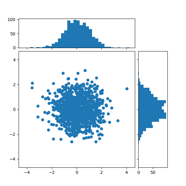
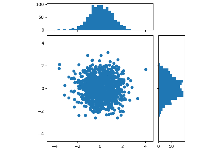
带直方图的散点图#
在散点图的 X 轴和 Y 轴边缘添加直方图。
此布局包括一个中央散点图,用于展示 x 和 y 之间的关系;顶部有一个直方图,显示 x 的分布;右侧有一个直方图,显示 y 的分布。
为了使主坐标轴与边缘坐标轴良好对齐,下面展示了两种方法:
虽然 Axes.inset_axes 可能稍微复杂一些,但它允许正确处理具有固定纵横比的主坐标轴。
我们首先定义一个函数,该函数将 x 和 y 数据以及三个坐标轴(用于散点图的主坐标轴和两个边缘坐标轴)作为输入。然后它将在提供的坐标轴内创建散点图和直方图。
import matplotlib.pyplot as plt
import numpy as np

# Fixing random state for reproducibility
np.random.seed(19680801)

# some random data
x = np.random.randn(1000)
y = np.random.randn(1000)


def scatter_hist(x, y, ax, ax_histx, ax_histy):
    # no labels
    ax_histx.tick_params(axis="x", labelbottom=False)
    ax_histy.tick_params(axis="y", labelleft=False)

    # the scatter plot:
    ax.scatter(x, y)

    # now determine nice limits by hand:
    binwidth = 0.25
    xymax = max(np.max(np.abs(x)), np.max(np.abs(y)))
    lim = (int(xymax/binwidth) + 1) * binwidth

    bins = np.arange(-lim, lim + binwidth, binwidth)
    ax_histx.hist(x, bins=bins)
    ax_histy.hist(y, bins=bins, orientation='horizontal')
使用 subplot_mosaic 定义坐标轴位置#
我们使用 subplot_mosaic 函数来定义三个坐标轴的位置和名称;空坐标轴由 '.' 指定。我们手动指定图的大小,并通过指定 width_ratios 和 height_ratios 参数使不同的坐标轴具有不同的大小。将 layout 参数设置为 'constrained' 以优化坐标轴之间的间距。
使用 inset_axes 定义坐标轴位置#
inset_axes 可用于将边缘坐标轴定位在主坐标轴的 外部。这样做的好处是主坐标轴的纵横比可以固定,并且边缘坐标轴将始终相对于坐标轴的位置绘制。
# Create a Figure, which doesn't have to be square.
fig = plt.figure(layout='constrained')
# Create the main Axes.
ax = fig.add_subplot()
# The main Axes' aspect can be fixed.
ax.set_aspect('equal')
# Create marginal Axes, which have 25% of the size of the main Axes.  Note that
# the inset Axes are positioned *outside* (on the right and the top) of the
# main Axes, by specifying axes coordinates greater than 1.  Axes coordinates
# less than 0 would likewise specify positions on the left and the bottom of
# the main Axes.
ax_histx = ax.inset_axes([0, 1.05, 1, 0.25], sharex=ax)
ax_histy = ax.inset_axes([1.05, 0, 0.25, 1], sharey=ax)
# Draw the scatter plot and marginals.
scatter_hist(x, y, ax, ax_histx, ax_histy)

plt.show()
虽然我们推荐使用上面描述的两种方法之一,但还有许多其他方法可以实现类似的布局:
可以使用
add_axes在相对坐标中手动定位坐标轴。可以使用 gridspec 创建布局 (
add_gridspec),并仅添加三个所需的坐标轴 (add_subplot)。可以使用
subplots创建四个子图,并手动删除右上角未使用的坐标轴。可以使用
axes_grid1工具包,如 使用可定位坐标轴将直方图与散点图对齐 中所示。
参考
本示例展示了以下函数、方法、类和模块的使用
脚本总运行时间: (0 分钟 2.812 秒)