Matplotlib 3.9.0 (2024年5月15日) 中的新特性#
有关自上次修订以来的所有问题和拉取请求列表,请参阅 3.9.0 (2024年5月15日) 的 GitHub 统计信息。
绘图和标注改进#
Axes.inset_axes 不再是实验性功能#
Axes.inset_axes 被认为可以稳定使用。
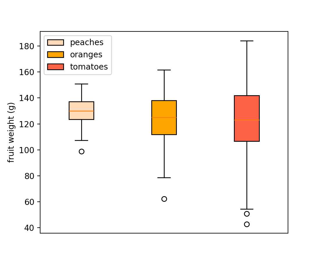
箱线图的图例支持#
箱线图现在支持 label 参数来创建图例条目。图例标签可以作为字符串列表传递,以便在单个 Axes.boxplot 调用中标记多个箱体。
np.random.seed(19680801)
fruit_weights = [
    np.random.normal(130, 10, size=100),
    np.random.normal(125, 20, size=100),
    np.random.normal(120, 30, size=100),
]
labels = ['peaches', 'oranges', 'tomatoes']
colors = ['peachpuff', 'orange', 'tomato']

fig, ax = plt.subplots()
ax.set_ylabel('fruit weight (g)')

bplot = ax.boxplot(fruit_weights,
                   patch_artist=True,  # fill with color
                   label=labels)

# fill with colors
for patch, color in zip(bplot['boxes'], colors):
    patch.set_facecolor(color)

ax.set_xticks([])
ax.legend()
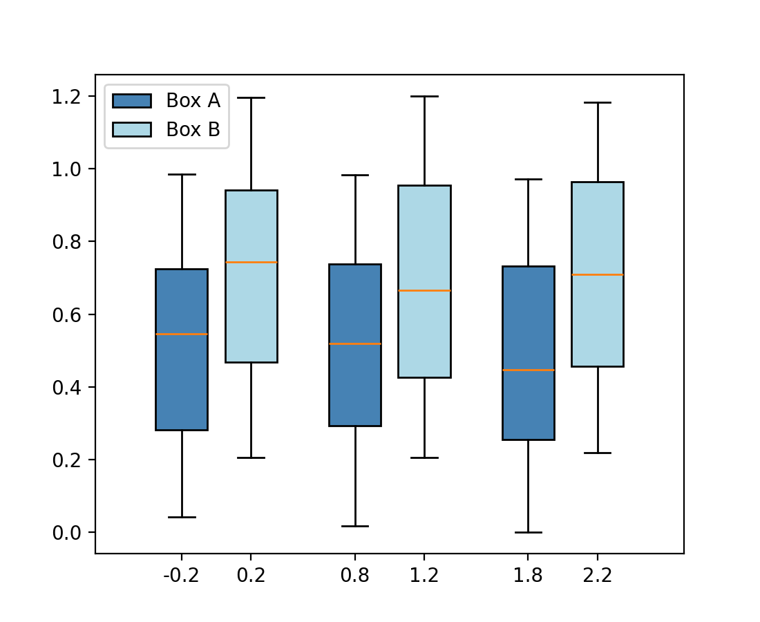
或者作为单个字符串传递给每个独立的 Axes.boxplot
fig, ax = plt.subplots()

data_A = np.random.random((100, 3))
data_B = np.random.random((100, 3)) + 0.2
pos = np.arange(3)

ax.boxplot(data_A, positions=pos - 0.2, patch_artist=True, label='Box A',
           boxprops={'facecolor': 'steelblue'})
ax.boxplot(data_B, positions=pos + 0.2, patch_artist=True, label='Box B',
           boxprops={'facecolor': 'lightblue'})

ax.legend()
饼图标签中的百分号在 usetex=True 时自动转义#
在使用 Axes.pie 时,通常会指定包含百分号(%)的标签,该符号在 LaTeX 中表示注释。当通过 rcParams["text.usetex"](默认值:False)启用 LaTeX 或传递 textprops={"usetex": True} 时,这曾导致百分号消失。
现在,百分号会自动转义(通过添加前置反斜杠),因此无论 usetex 设置如何,它都会显示。如果您已预先转义了百分号,这将S被检测到,并保持不变。
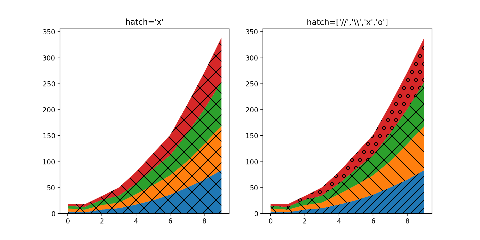
堆积图 (stackplot) 的 hatch 参数#
stackplot 的 hatch 参数现在接受一个字符串列表,用于描述将按顺序应用于堆栈中各层的填充样式。
fig, (ax1, ax2) = plt.subplots(ncols=2, figsize=(10,5))

cols = 10
rows = 4
data = (
np.reshape(np.arange(0, cols, 1), (1, -1)) ** 2
+ np.reshape(np.arange(0, rows), (-1, 1))
+ np.random.random((rows, cols))*5
)
x = range(data.shape[1])
ax1.stackplot(x, data, hatch="x")
ax2.stackplot(x, data, hatch=["//","\\","x","o"])

ax1.set_title("hatch='x'")
ax2.set_title("hatch=['//','\\\\','x','o']")

plt.show()
新增选项,可仅绘制小提琴图的一半#
将参数 side 设置为 'low' 或 'high' 允许只绘制 Axes.violinplot 的一半。
# Fake data with reproducible random state.
np.random.seed(19680801)
data = np.random.normal(0, 8, size=100)

fig, ax = plt.subplots()

ax.violinplot(data, [0], showmeans=True, showextrema=True)
ax.violinplot(data, [1], showmeans=True, showextrema=True, side='low')
ax.violinplot(data, [2], showmeans=True, showextrema=True, side='high')

ax.set_title('Violin Sides Example')
ax.set_xticks([0, 1, 2], ['Default', 'side="low"', 'side="high"'])
ax.set_yticklabels([])

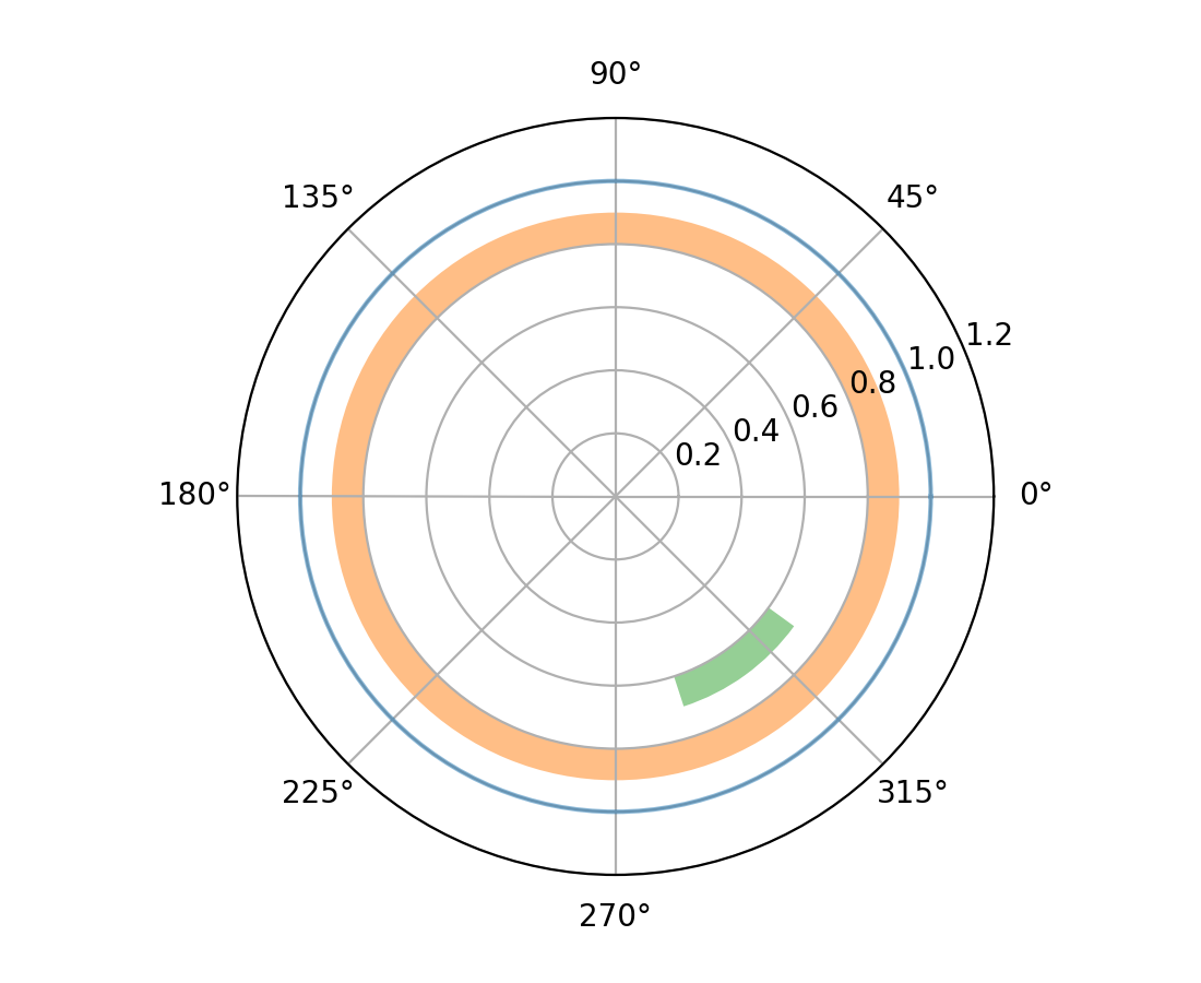
极坐标轴上的 axhline 和 axhspan#
... 现在会绘制圆形和圆弧(axhline)或环形和扇形(axhspan)。
fig = plt.figure()
ax = fig.add_subplot(projection="polar")
ax.set_rlim(0, 1.2)

ax.axhline(1, c="C0", alpha=.5)
ax.axhspan(.8, .9, fc="C1", alpha=.5)
ax.axhspan(.6, .7, .8, .9, fc="C2", alpha=.5)
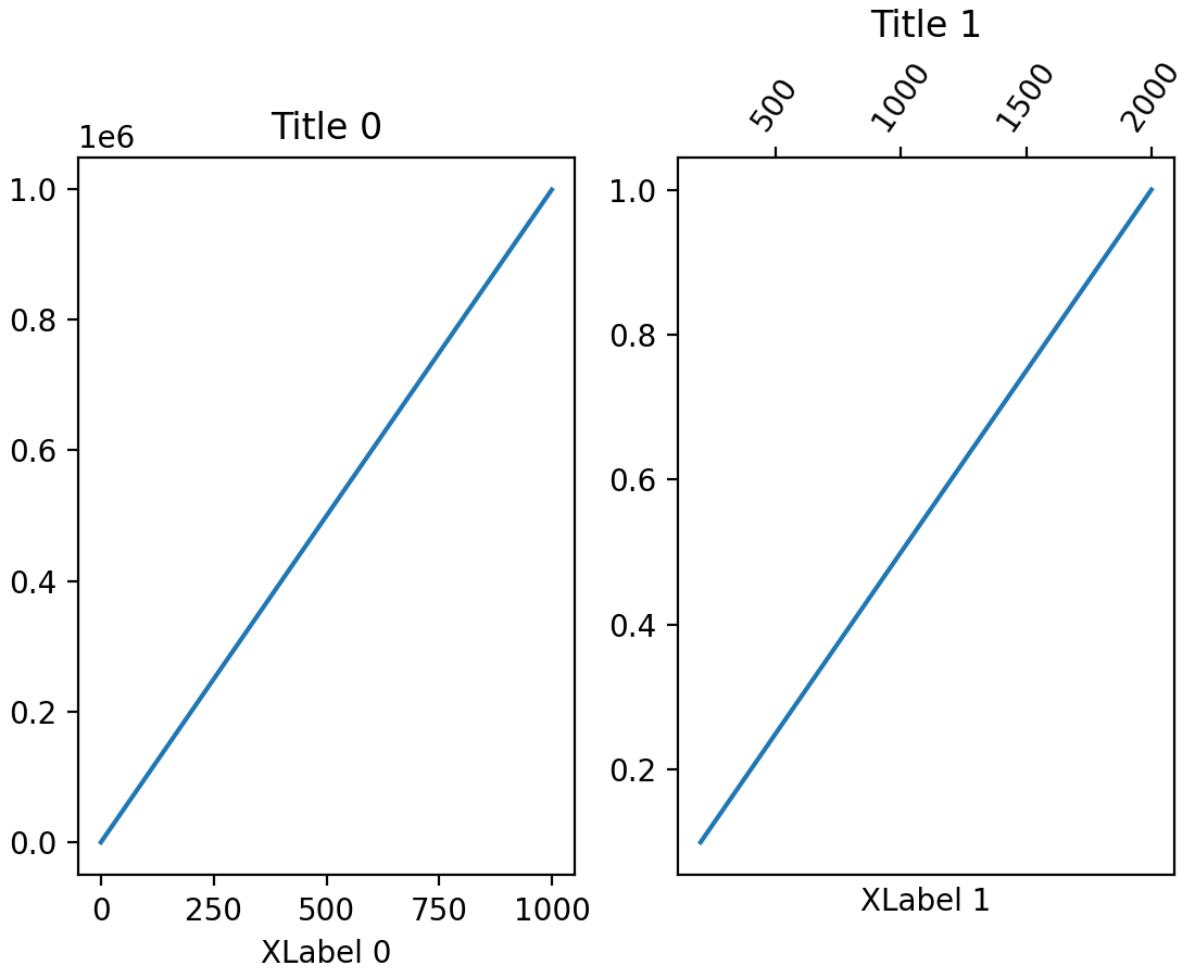
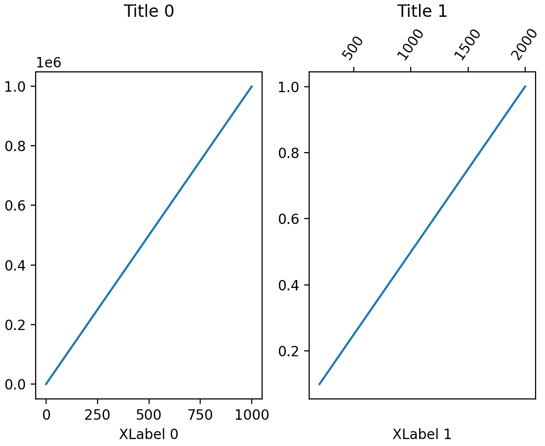
子图标题现在可以自动对齐#
如果刻度标签或 x 轴标签放置在某个子图的顶部,子图坐标轴标题可能会垂直错位。现在,Figure 类上的新方法 align_titles 将会垂直对齐标题。
fig, axs = plt.subplots(1, 2, layout='constrained')

axs[0].plot(np.arange(0, 1e6, 1000))
axs[0].set_title('Title 0')
axs[0].set_xlabel('XLabel 0')

axs[1].plot(np.arange(1, 0, -0.1) * 2000, np.arange(1, 0, -0.1))
axs[1].set_title('Title 1')
axs[1].set_xlabel('XLabel 1')
axs[1].xaxis.tick_top()
axs[1].tick_params(axis='x', rotation=55)

fig.align_labels()
fig.align_titles()
axisartist 现在可以与标准 Formatters 一起使用#
... 而不再局限于 axisartist 特有的格式器。
切换坐标轴上的次刻度#
坐标轴 Axis 上的次刻度可以使用 minorticks_on 和 minorticks_off 进行显示或移除;例如,ax.xaxis.minorticks_on()。另请参阅 minorticks_on。
StrMethodFormatter 现在遵循 axes.unicode_minus 设置#
在格式化负值时,如果 rcParams["axes.unicode_minus"](默认值:True)已设置,StrMethodFormatter 现在将使用 Unicode 减号。
>>> from matplotlib.ticker import StrMethodFormatter
>>> with plt.rc_context({'axes.unicode_minus': False}):
...     formatter = StrMethodFormatter('{x}')
...     print(formatter.format_data(-10))
-10
>>> with plt.rc_context({'axes.unicode_minus': True}):
...     formatter = StrMethodFormatter('{x}')
...     print(formatter.format_data(-10))
−10
图形、坐标轴和图例布局#
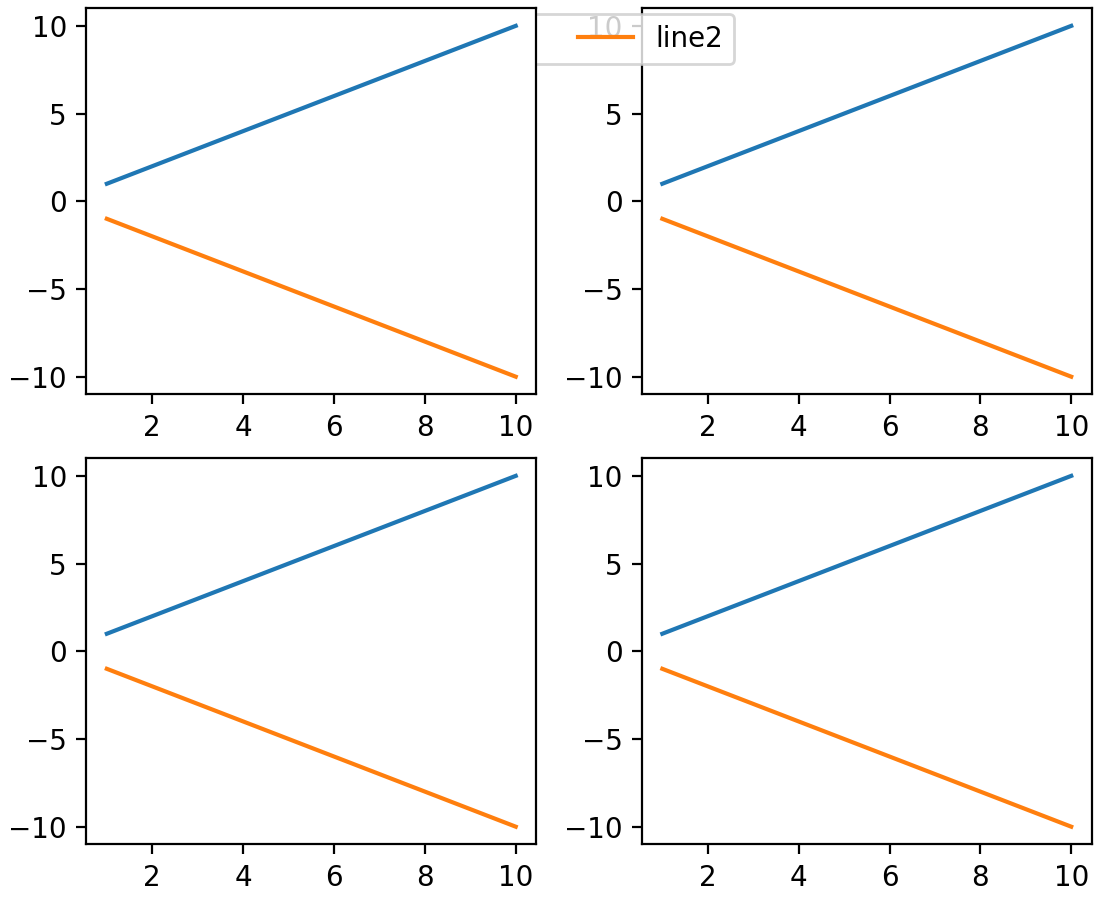
子图形现在具有可控制的 zorder#
以前,设置子图形的 zorder 没有效果,它们总是绘制在任何图形级别的艺术家(例如,图形级别的图例)之上。现在,子图形的行为与其他艺术家一样,它们的 zorder 可以被控制,默认 zorder 为 0。
x = np.linspace(1, 10, 10)
y1, y2 = x, -x
fig = plt.figure(constrained_layout=True)
subfigs = fig.subfigures(nrows=1, ncols=2)
for subfig in subfigs:
    axarr = subfig.subplots(2, 1)
    for ax in axarr.flatten():
        (l1,) = ax.plot(x, y1, label="line1")
        (l2,) = ax.plot(x, y2, label="line2")
subfigs[0].set_zorder(6)
l = fig.legend(handles=[l1, l2], loc="upper center", ncol=2)
xmargin、ymargin 和 zmargin 的获取器#
已添加 Axes.get_xmargin、Axes.get_ymargin 和 Axes3D.get_zmargin 方法,分别用于返回由 Axes.set_xmargin、Axes.set_ymargin 和 Axes3D.set_zmargin 设置的边距值。
Mathtext 改进#
mathtext 文档改进#
文档已更新,直接从解析器获取信息。这意味着(几乎)所有支持的符号、运算符等都显示在 编写数学表达式。
mathtext 间距修正#
由于文档更新,许多关系运算符和操作符的间距已正确分类,因此将正确显示间距。
小部件改进#
3D 绘图改进#
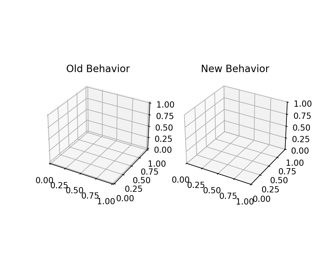
现在设置 3D 坐标轴限制会精确设置限制#
以前,设置 3D 坐标轴的限制总会向限制添加一个小边距。现在,限制默认精确设置。新引入的 rcparam axes3d.automargin 可用于恢复到自动添加边距的旧行为。
fig, axs = plt.subplots(1, 2, subplot_kw={'projection': '3d'})

plt.rcParams['axes3d.automargin'] = True
axs[0].set(xlim=(0, 1), ylim=(0, 1), zlim=(0, 1), title='Old Behavior')

plt.rcParams['axes3d.automargin'] = False  # the default in 3.9.0
axs[1].set(xlim=(0, 1), ylim=(0, 1), zlim=(0, 1), title='New Behavior')
其他改进#
后端注册表 (BackendRegistry)#
新的 BackendRegistry 类是可用后端的单一事实来源。单例实例为 matplotlib.backends.backend_registry。它由 Matplotlib 内部使用,并且从 IPython 8.24.0 开始,也由 IPython(以及 Jupyter)使用。
后端有三种来源:内置(源代码在 Matplotlib 仓库中)、显式 module://some.backend 语法(通过加载模块获取后端),或通过入口点(外部包中的自注册后端)。
要获取所有已注册后端的列表,请使用
>>> from matplotlib.backends import backend_registry
>>> backend_registry.list_all()
为 EllipseCollection 添加 widths、heights 和 angles 设置器#
EllipseCollection 的 widths、heights 和 angles 值现在可以在集合创建后进行更改。
from matplotlib.collections import EllipseCollection

rng = np.random.default_rng(0)

widths = (2, )
heights = (3, )
angles = (45, )
offsets = rng.random((10, 2)) * 10

fig, ax = plt.subplots()

ec = EllipseCollection(
    widths=widths,
    heights=heights,
    angles=angles,
    offsets=offsets,
    units='x',
    offset_transform=ax.transData,
    )

ax.add_collection(ec)
ax.set_xlim(-2, 12)
ax.set_ylim(-2, 12)

new_widths = rng.random((10, 2)) * 2
new_heights = rng.random((10, 2)) * 3
new_angles = rng.random((10, 2)) * 180

ec.set(widths=new_widths, heights=new_heights, angles=new_angles)
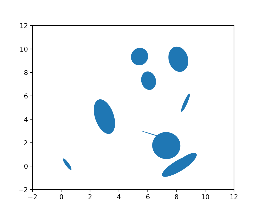
image.interpolation_stage rcParam#
这个新的 rcParam 控制图像插值是在“数据”空间还是在“rgba”空间中进行。
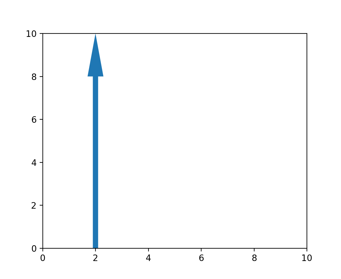
箭头补丁位置现在可修改#
已添加一个设置器方法,允许更新 patches.Arrow 对象的位置,而无需完全重绘。
from matplotlib import animation
from matplotlib.patches import Arrow

fig, ax = plt.subplots()
ax.set_xlim(0, 10)
ax.set_ylim(0, 10)

a = Arrow(2, 0, 0, 10)
ax.add_patch(a)


# code for modifying the arrow
def update(i):
    a.set_data(x=.5, dx=i, dy=6, width=2)


ani = animation.FuncAnimation(fig, update, frames=15, interval=90, blit=False)

plt.show()
NonUniformImage 现在支持鼠标悬停#
当鼠标悬停在 NonUniformImage 上时,现在会显示数据值。