Matplotlib 3.10.0 中的新功能(2024 年 12 月 13 日)#
有关自上次修订以来的所有问题和拉取请求列表,请参阅 3.10.3 (2025年5月8日) 的 GitHub 统计数据。
新的更易访问的颜色循环#
添加了一个名为“petroff10”的新颜色循环。这个循环是结合算法强制的可访问性约束(包括色觉缺陷建模)和基于众包颜色偏好调查开发的机器学习美学模型构建的。它旨在兼顾普遍的美学愉悦性和色盲可访问性,以期作为通用设计中的默认值。有关更多详细信息,请参阅 Petroff, M. A.: "Accessible Color Sequences for Data Visualization" 和相关的 SciPy 演讲。样式表 参考中包含了演示。要将此颜色循环加载为默认值:
import matplotlib.pyplot as plt
plt.style.use('petroff10')
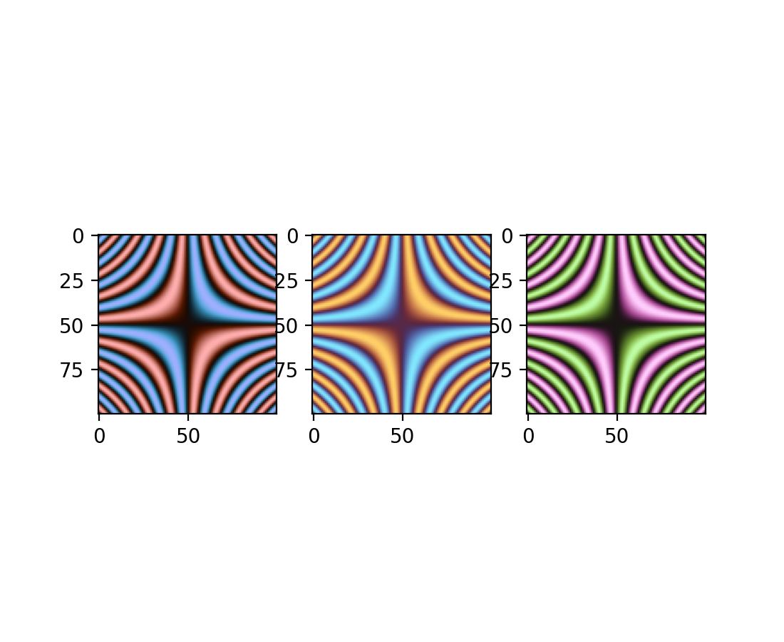
深色模式发散色图#
增加了三种发散色图:“berlin”、“managua”和“vanimo”。它们是深色模式发散色图,中心亮度最低,两极亮度最高。这些色图取自 F. Crameri 的 Scientific colour maps 版本 8.0.1 (DOI: https://doi.org/10.5281/zenodo.1243862)。
import numpy as np
import matplotlib.pyplot as plt

vals = np.linspace(-5, 5, 100)
x, y = np.meshgrid(vals, vals)
img = np.sin(x*y)

_, ax = plt.subplots(1, 3)
ax[0].imshow(img, cmap=plt.cm.berlin)
ax[1].imshow(img, cmap=plt.cm.managua)
ax[2].imshow(img, cmap=plt.cm.vanimo)
绘图和注释改进#
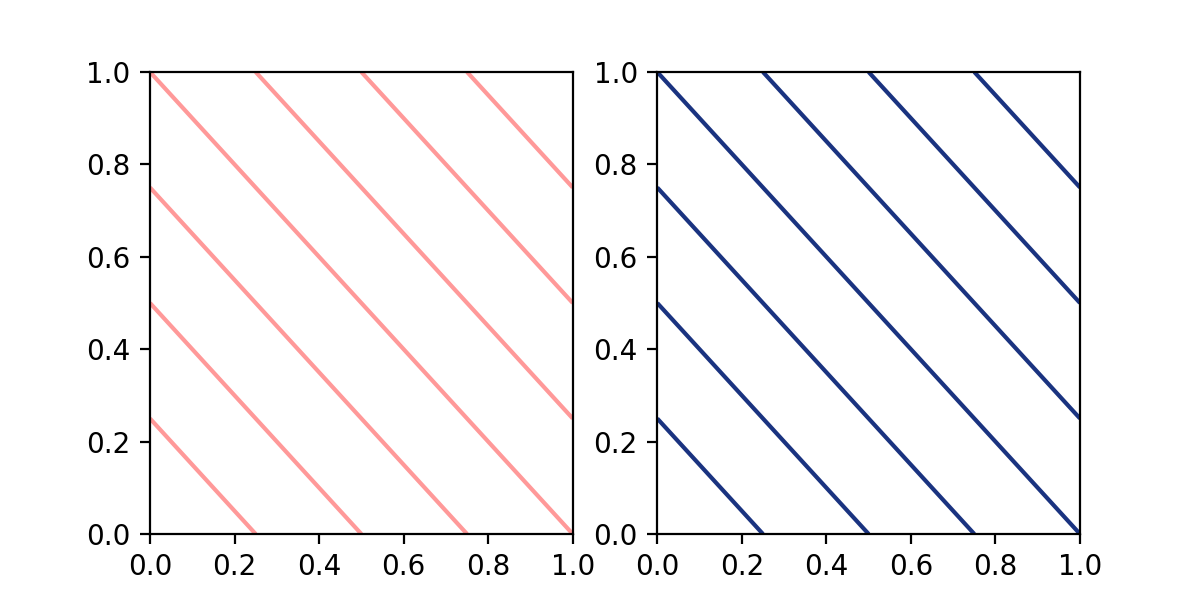
在 contour 和 contourf 中指定单一颜色#
contour 和 contourf 以前接受以字符串形式提供的单一颜色。现在这个限制已被移除,可以传递 指定颜色 教程中描述的任何格式的单一颜色。
import matplotlib.pyplot as plt

fig, (ax1, ax2) = plt.subplots(ncols=2, figsize=(6, 3))
z = [[0, 1], [1, 2]]

ax1.contour(z, colors=('r', 0.4))
ax2.contour(z, colors=(0.1, 0.2, 0.5))

plt.show()
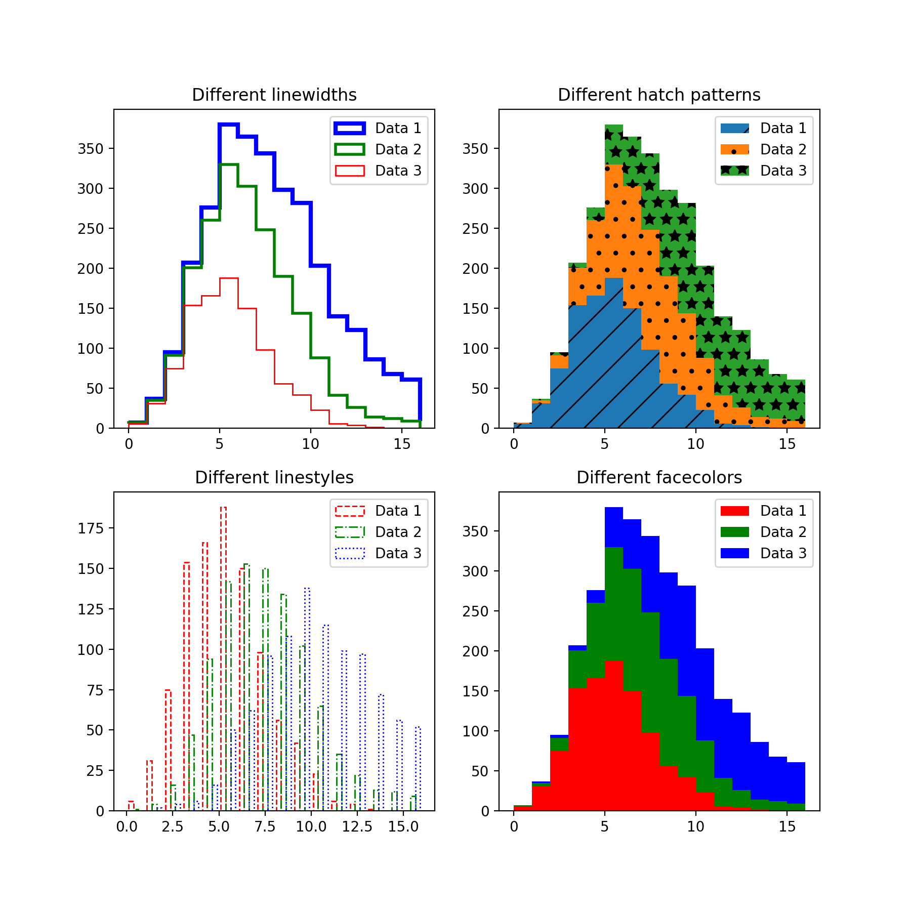
向量化 hist 样式参数#
hist 方法的参数 hatch、edgecolor、facecolor、linewidth 和 linestyle 现在已向量化。这意味着当输入 x 包含多个数据集时,您可以为每个直方图传递独立的参数。
import matplotlib.pyplot as plt
import numpy as np
np.random.seed(19680801)

fig, ((ax1, ax2), (ax3, ax4)) = plt.subplots(2, 2, figsize=(9, 9))

data1 = np.random.poisson(5, 1000)
data2 = np.random.poisson(7, 1000)
data3 = np.random.poisson(10, 1000)

labels = ["Data 1", "Data 2", "Data 3"]

ax1.hist([data1, data2, data3], bins=range(17), histtype="step", stacked=True,
         edgecolor=["red", "green", "blue"], linewidth=[1, 2, 3])
ax1.set_title("Different linewidths")
ax1.legend(labels)

ax2.hist([data1, data2, data3], bins=range(17), histtype="barstacked",
         hatch=["/", ".", "*"])
ax2.set_title("Different hatch patterns")
ax2.legend(labels)

ax3.hist([data1, data2, data3], bins=range(17), histtype="bar", fill=False,
         edgecolor=["red", "green", "blue"], linestyle=["--", "-.", ":"])
ax3.set_title("Different linestyles")
ax3.legend(labels)

ax4.hist([data1, data2, data3], bins=range(17), histtype="barstacked",
         facecolor=["red", "green", "blue"])
ax4.set_title("Different facecolors")
ax4.legend(labels)

plt.show()
InsetIndicator 艺术对象#
indicate_inset 和 indicate_inset_zoom 现在返回 InsetIndicator 的实例,其中包含矩形和连接器补丁。这些补丁现在会自动更新,因此:
ax.indicate_inset_zoom(ax_inset)
ax_inset.set_xlim(new_lim)
现在与以下结果相同:
ax_inset.set_xlim(new_lim)
ax.indicate_inset_zoom(ax_inset)
matplotlib.ticker.EngFormatter 现在可以计算偏移量#
matplotlib.ticker.EngFormatter 获得了在坐标轴附近显示偏移文本的能力。它与 matplotlib.ticker.ScalarFormatter 共享逻辑,能够判断数据是否符合显示偏移的条件,并使用适当的 SI 数量前缀和提供的 unit 来显示它。
要启用此新行为,只需在实例化 matplotlib.ticker.EngFormatter 时传递 useOffset=True。请参阅示例 带 SI 前缀的偏移量和自然数量级。
修复 ImageGrid 单个颜色条的填充#
当 ImageGrid 设置为 cbar_mode="single" 时,不再在坐标轴和颜色条之间为 cbar_location 为“left”和“bottom”的情况添加 axes_pad。如果需要,请使用 cbar_pad 添加额外的间距。
ax.table 将接受 pandas DataFrame#
table 方法现在可以接受 Pandas DataFrame 作为 cellText 参数。
import matplotlib.pyplot as plt
import pandas as pd

data = {
    'Letter': ['A', 'B', 'C'],
    'Number': [100, 200, 300]
}

df = pd.DataFrame(data)
fig, ax = plt.subplots()
table = ax.table(df, loc='center')  # or table = ax.table(cellText=df, loc='center')
ax.axis('off')
plt.show()
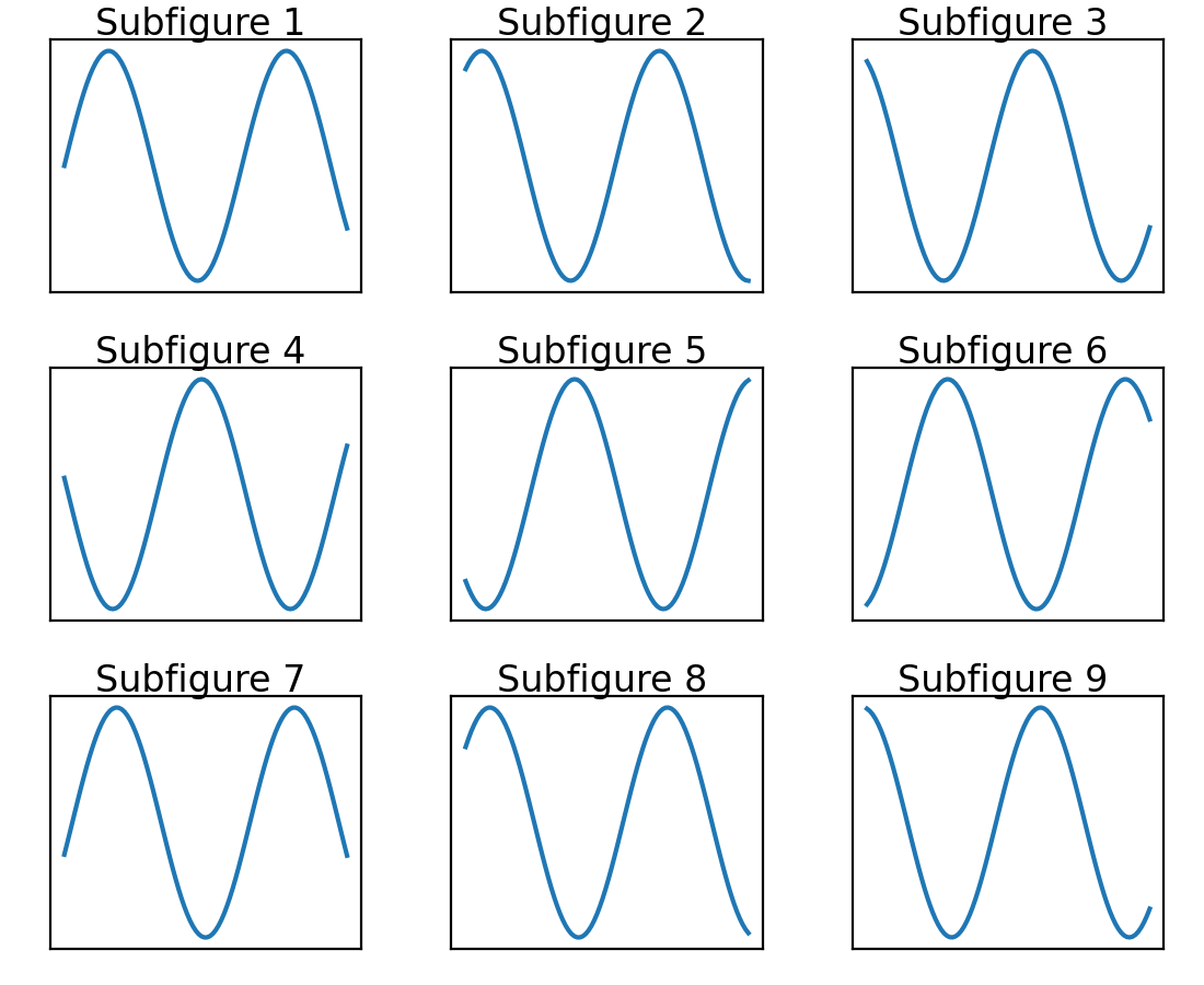
子图现在按行主序添加#
Figure.subfigures 现在按行主序添加,以保持 API 一致性。
import matplotlib.pyplot as plt

fig = plt.figure()
subfigs = fig.subfigures(3, 3)
x = np.linspace(0, 10, 100)

for i, sf in enumerate(fig.subfigs):
    ax = sf.subplots()
    ax.plot(x, np.sin(x + i), label=f'Subfigure {i+1}')
    sf.suptitle(f'Subfigure {i+1}')
    ax.set_xticks([])
    ax.set_yticks([])
plt.show()
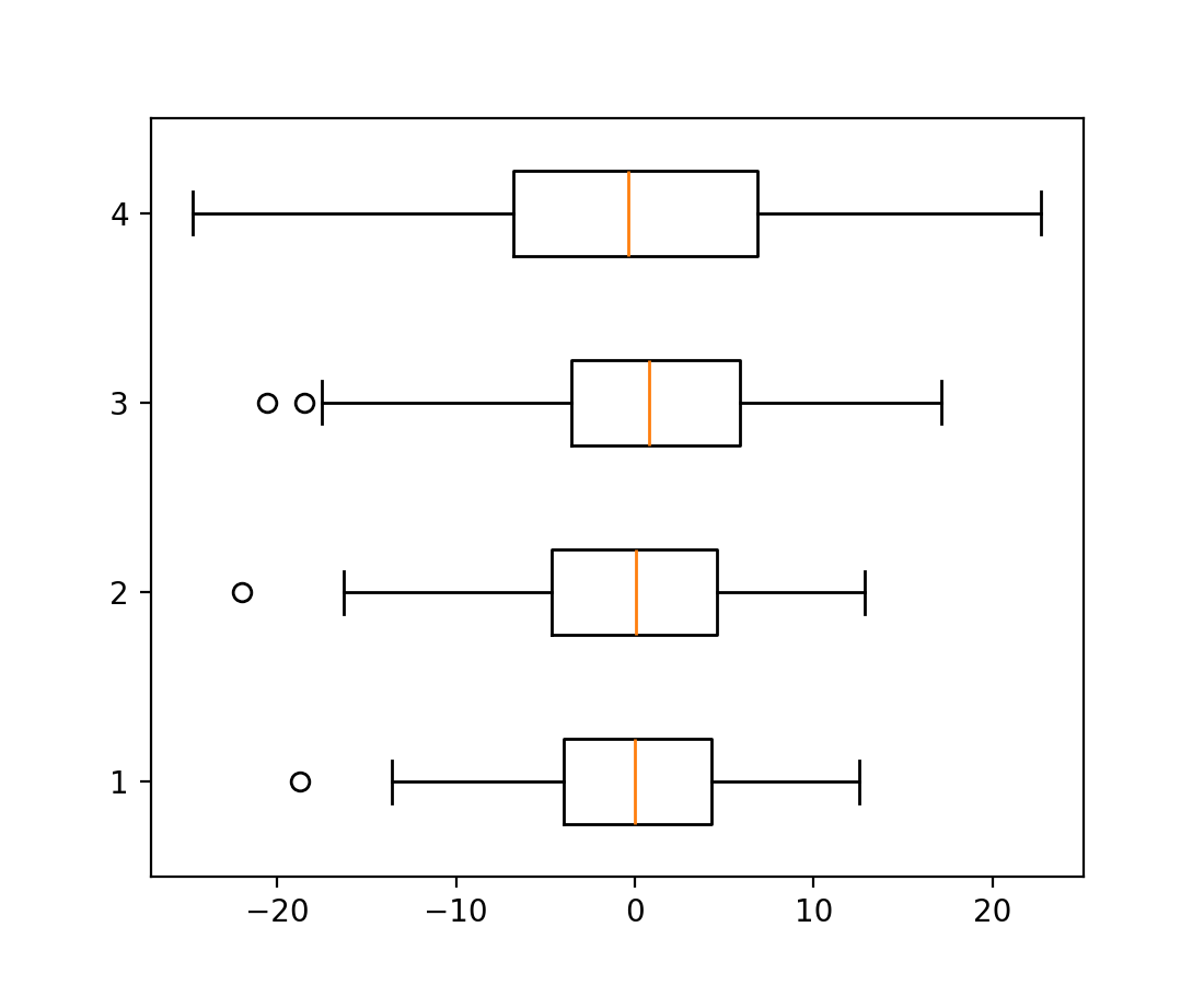
boxplot 和 bxp 方向参数#
箱线图新增参数 orientation: {"vertical", "horizontal"},用于改变图的方向。这取代了已弃用的 vert: bool 参数。
import matplotlib.pyplot as plt
import numpy as np

fig, ax = plt.subplots()
np.random.seed(19680801)
all_data = [np.random.normal(0, std, 100) for std in range(6, 10)]

ax.boxplot(all_data, orientation='horizontal')
plt.show()
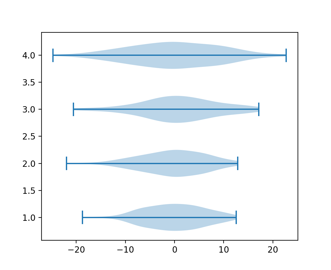
violinplot 和 violin 方向参数#
小提琴图新增参数 orientation: {"vertical", "horizontal"},用于改变图的方向。这将取代已弃用的 vert: bool 参数。
import matplotlib.pyplot as plt
import numpy as np

fig, ax = plt.subplots()
np.random.seed(19680801)
all_data = [np.random.normal(0, std, 100) for std in range(6, 10)]

ax.violinplot(all_data, orientation='horizontal')
plt.show()
FillBetweenPolyCollection#
新的类 matplotlib.collections.FillBetweenPolyCollection 提供了 set_data 方法,例如支持重采样 (galleries/event_handling/resample.html)。matplotlib.axes.Axes.fill_between() 和 matplotlib.axes.Axes.fill_betweenx() 现在返回这个新类。
import numpy as np
from matplotlib import pyplot as plt

t = np.linspace(0, 1)

fig, ax = plt.subplots()
coll = ax.fill_between(t, -t**2, t**2)
fig.savefig("before.png")

coll.set_data(t, -t**4, t**4)
fig.savefig("after.png")
matplotlib.colorizer.Colorizer 作为 norm 和 cmap 的容器#
matplotlib.colorizer.Colorizer封装了数据到颜色的管道。它使颜色映射的重用变得更容易,例如跨多个图像。支持 norm 和 cmap 关键字参数的绘图方法现在也接受 colorizer 关键字参数。
在下面的示例中,norm 和 cmap 同时在多个图上更改
import matplotlib.pyplot as plt
import matplotlib as mpl
import numpy as np

x = np.linspace(-2, 2, 50)[np.newaxis, :]
y = np.linspace(-2, 2, 50)[:, np.newaxis]
im_0 = 1 * np.exp( - (x**2 + y**2 - x * y))
im_1 = 2 * np.exp( - (x**2 + y**2 + x * y))

colorizer = mpl.colorizer.Colorizer()
fig, axes = plt.subplots(1, 2, figsize=(6, 2))
cim_0 = axes[0].imshow(im_0, colorizer=colorizer)
fig.colorbar(cim_0)
cim_1 = axes[1].imshow(im_1, colorizer=colorizer)
fig.colorbar(cim_1)

colorizer.vmin = 0.5
colorizer.vmax = 2
colorizer.cmap = 'RdBu'

所有使用数据到颜色管道的绘图方法,如果未提供,现在都会创建一个 colorizer 对象。后续的艺术对象可以重用此对象,从而共享单个数据到颜色管道。
import matplotlib.pyplot as plt
import matplotlib as mpl
import numpy as np

x = np.linspace(-2, 2, 50)[np.newaxis, :]
y = np.linspace(-2, 2, 50)[:, np.newaxis]
im_0 = 1 * np.exp( - (x**2 + y**2 - x * y))
im_1 = 2 * np.exp( - (x**2 + y**2 + x * y))

fig, axes = plt.subplots(1, 2, figsize=(6, 2))

cim_0 = axes[0].imshow(im_0, cmap='RdBu', vmin=0.5, vmax=2)
fig.colorbar(cim_0)
cim_1 = axes[1].imshow(im_1, colorizer=cim_0.colorizer)
fig.colorbar(cim_1)

cim_1.cmap = 'rainbow'
3D 绘图改进#
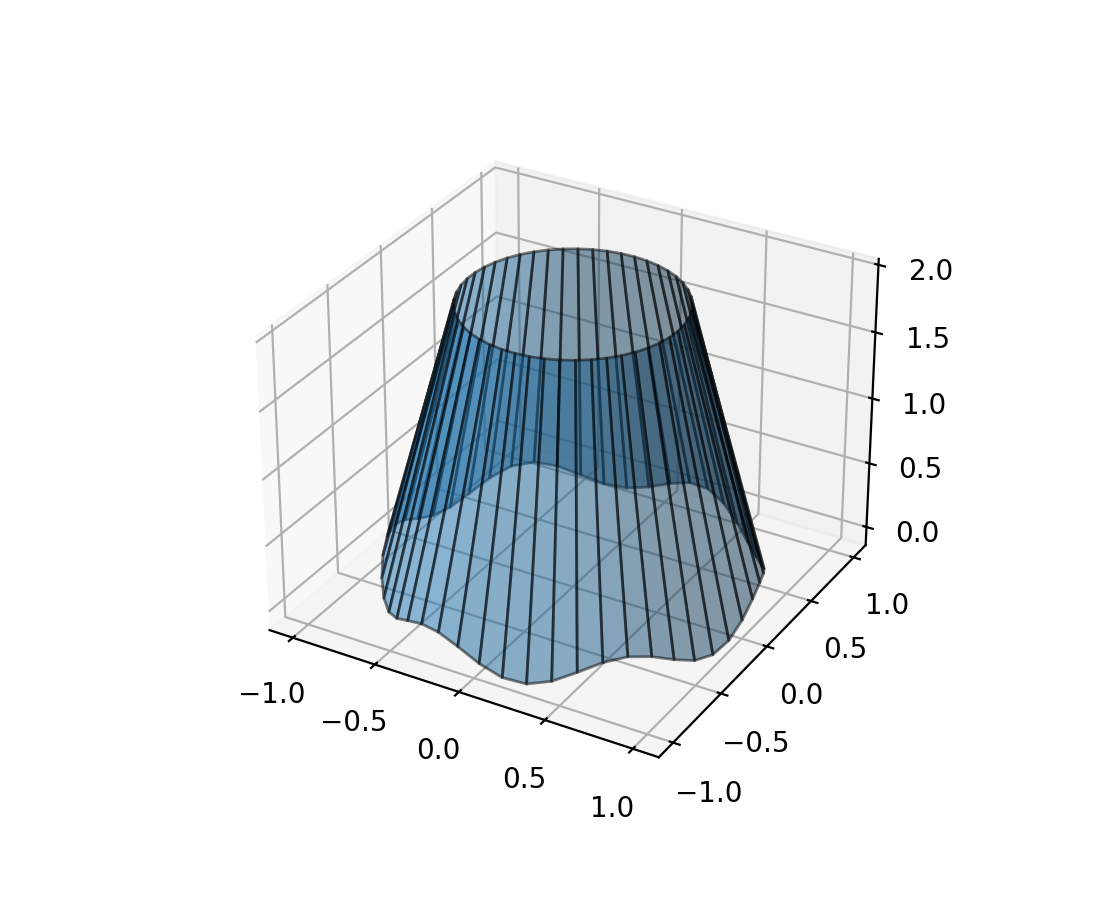
3D 线条之间的填充#
新的方法 Axes3D.fill_between 允许用多边形填充两条 3D 线条之间的表面。
N = 50
theta = np.linspace(0, 2*np.pi, N)

x1 = np.cos(theta)
y1 = np.sin(theta)
z1 = 0.1 * np.sin(6 * theta)

x2 = 0.6 * np.cos(theta)
y2 = 0.6 * np.sin(theta)
z2 = 2  # Note that scalar values work in addition to length N arrays

fig = plt.figure()
ax = fig.add_subplot(projection='3d')
ax.fill_between(x1, y1, z1, x2, y2, z2,
                alpha=0.5, edgecolor='k')
用鼠标旋转 3D 图#
用鼠标旋转三维图变得更加直观。现在,图对鼠标移动的反应方式相同,与当前的特定方向无关;并且可以控制所有 3 个旋转自由度(方位角、仰角和滚动)。默认情况下,它使用 Ken Shoemake 的 ARCBALL 的变体 [1]。鼠标旋转的特定样式可以通过 rcParams["axes3d.mouserotationstyle"](默认值:'arcball')设置。另请参阅 鼠标旋转。
要恢复到原始的鼠标旋转样式,请创建一个包含以下内容的 matplotlibrc 文件:
axes3d.mouserotationstyle: azel
要尝试各种鼠标旋转样式之一:
import matplotlib as mpl
mpl.rcParams['axes3d.mouserotationstyle'] = 'trackball'  # 'azel', 'trackball', 'sphere', or 'arcball'

import numpy as np
import matplotlib.pyplot as plt
from matplotlib import cm

ax = plt.figure().add_subplot(projection='3d')

X = np.arange(-5, 5, 0.25)
Y = np.arange(-5, 5, 0.25)
X, Y = np.meshgrid(X, Y)
R = np.sqrt(X**2 + Y**2)
Z = np.sin(R)

surf = ax.plot_surface(X, Y, Z, cmap=cm.coolwarm,
                       linewidth=0, antialiased=False)

plt.show()
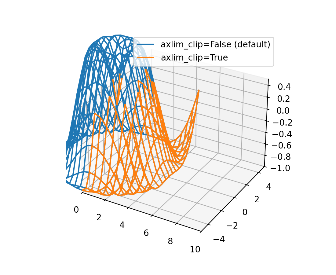
3D 图中的数据现在可以动态剪裁到坐标轴视图限制#
所有 3D 绘图函数现在都支持 axlim_clip 关键字参数,它会将数据剪裁到坐标轴视图限制,隐藏超出这些边界的所有数据。此剪裁将在平移和缩放时实时动态应用。
请注意,如果线段或 3D 补丁的一个顶点被剪裁,则整个线段或补丁将被隐藏。无法显示部分线条或补丁使其在视图框边界处“平滑”截断是当前渲染器的限制。
import matplotlib.pyplot as plt
import numpy as np

fig, ax = plt.subplots(subplot_kw={"projection": "3d"})
x = np.arange(-5, 5, 0.5)
y = np.arange(-5, 5, 0.5)
X, Y = np.meshgrid(x, y)
R = np.sqrt(X**2 + Y**2)
Z = np.sin(R)

# Note that when a line has one vertex outside the view limits, the entire
# line is hidden. The same is true for 3D patches (not shown).
# In this example, data where x < 0 or z > 0.5 is clipped.
ax.plot_wireframe(X, Y, Z, color='C0')
ax.plot_wireframe(X, Y, Z, color='C1', axlim_clip=True)
ax.set(xlim=(0, 10), ylim=(-5, 5), zlim=(-1, 0.5))
ax.legend(['axlim_clip=False (default)', 'axlim_clip=True'])

初步支持自由线程 CPython 3.13#
Matplotlib 3.10 初步支持 CPython 3.13 的自由线程构建。有关自由线程 Python 的更多详细信息,请参阅 https://py-free-threading.github.io、PEP 703 和 CPython 3.13 发行说明。
对自由线程 Python 的支持并不意味着 Matplotlib 完全是线程安全的。我们期望在单个线程中使用 Figure 可以正常工作,尽管输入数据通常会被复制,但在数据未复制的情况下,从另一个线程修改用于绘图的数据对象可能会导致不一致。强烈不建议使用任何全局状态(例如 pyplot 模块),并且不太可能持续正常工作。另请注意,大多数 GUI 工具包都期望在主线程上运行,因此交互式使用可能会受到限制或不受其他线程支持。
如果您对自由线程 Python 感兴趣,例如因为您有一个基于多进程的工作流,并且希望使用 Python 线程运行它,我们鼓励您进行测试和实验。如果您遇到问题,并怀疑是 Matplotlib 引起的,请提交一个 issue,并首先检查该错误是否也发生在“常规”非自由线程 CPython 3.13 构建中。
其他改进#
svg.id rcParam#
rcParams["svg.id"](默认值:None)允许您在顶级 <svg> 标签中插入一个 id 属性。
例如,rcParams["svg.id"] = "svg1" 会导致:
<svg
    xmlns:xlink="http://www.w3.org/1999/xlink"
    width="50pt" height="50pt"
    viewBox="0 0 50 50"
    xmlns="http://www.w3.org/2000/svg"
    version="1.1"
    id="svg1"
></svg>
如果您想在另一个 SVG 文件中通过 <use> 标签链接整个 matplotlib SVG 文件,这会很有用。
<svg>
<use
    width="50" height="50"
    xlink:href="mpl.svg#svg1" id="use1"
    x="0" y="0"
/></svg>
其中 #svg1 指示符现在将引用顶级 <svg> 标签,因此将导致包含整个文件。
默认情况下,不包含 id 标签。
异常处理控制#
当传递无效关键字参数时抛出的异常现在包含该参数名称作为异常的 name 属性。这为异常处理提供了更多控制。
import matplotlib.pyplot as plt

def wobbly_plot(args, **kwargs):
    w = kwargs.pop('wobble_factor', None)

    try:
        plt.plot(args, **kwargs)
    except AttributeError as e:
        raise AttributeError(f'wobbly_plot does not take parameter {e.name}') from e


wobbly_plot([0, 1], wibble_factor=5)
AttributeError: wobbly_plot does not take parameter wibble_factor
Agg 渲染器增加图表限制#
使用 Agg 渲染器的图现在每个方向的像素限制增加到 2**23,而不是 2**16。此外,导致艺术对象在水平方向超出 2**15 像素时无法渲染的错误也已修复。
请注意,如果您使用的是 GUI 后端,它可能有自己的较小限制(这些限制本身可能取决于屏幕尺寸)。
杂项更改#
matplotlib.ticker.ScalarFormatter类新增了一个实例化参数usetex。由于内部优化,创建 Axes 现在快了 20-25%。
Figure.subfigures和SubFigure的 API 现在被认为是稳定的。