开始使用 mpl-probscale
安装
mpl-probscale 基于 Python 3.6 开发。它也在 Python 3.4、3.5 甚至 2.7 (目前) 上进行了测试。
通过 Conda
mpl-probscale 的官方版本可在 conda-forge 上找到
conda install --channel=conda-forge mpl-probscale
开发版本的最新构建可在我的频道上找到
conda install --channel=conda-forge mpl-probscale
通过 PyPI
官方源代码版本也可在 PyPI 上获取 pip install probscale
从源代码
mpl-probscale 是一个纯 Python 包。在任何平台上从源代码安装它应该都非常简单。为此,请从 github 下载或克隆,如果需要解压归档文件,然后执行
cd mpl-probscale # or wherever the setup.py got placed
pip install .
我推荐使用 pip install . 而不是 python setup.py install,原因 我尚不完全理解。
%matplotlib inline
import warnings
warnings.simplefilter('ignore')

import numpy
from matplotlib import pyplot
from scipy import stats
import seaborn

clear_bkgd = {'axes.facecolor':'none', 'figure.facecolor':'none'}
seaborn.set(style='ticks', context='talk', color_codes=True, rc=clear_bkgd)
背景
内置 Matplotlib 刻度
对于普通用户而言,您可以将 Matplotlib 刻度设置为“线性”或“对数”刻度。还有其他类型 (例如 logit, symlog),但我很少在实际应用中看到它们。
线性刻度是默认设置
fig, ax = pyplot.subplots()
seaborn.despine(fig=fig)
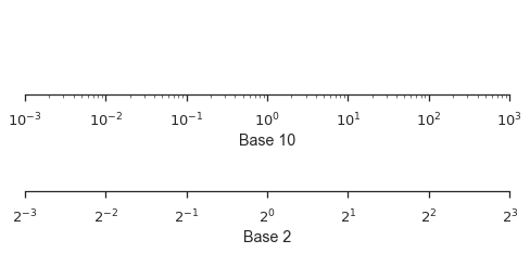
当您的数据跨越多个数量级时,对数刻度会很有用,并且不一定是基于 10 的。
fig, (ax1, ax2) = pyplot.subplots(nrows=2, figsize=(8,3))
ax1.set_xscale('log')
ax1.set_xlim(left=1e-3, right=1e3)
ax1.set_xlabel("Base 10")
ax1.set_yticks([])

ax2.set_xscale('log', basex=2)
ax2.set_xlim(left=2**-3, right=2**3)
ax2.set_xlabel("Base 2")
ax2.set_yticks([])

seaborn.despine(fig=fig, left=True)
概率刻度
mpl-probscale 允许您使用概率刻度。您所需要做的就是导入它。
在导入之前,Matplotlib 中没有可用的概率刻度
try:
    fig, ax = pyplot.subplots()
    ax.set_xscale('prob')
except ValueError as e:
    pyplot.close(fig)
    print(e)
Unknown scale type 'prob'
要访问概率刻度,只需导入 probscale 模块。
import probscale
fig, ax = pyplot.subplots(figsize=(8, 3))
ax.set_xscale('prob')
ax.set_xlim(left=0.5, right=99.5)
ax.set_xlabel('Normal probability scale (%)')
seaborn.despine(fig=fig)
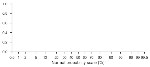
概率刻度默认为标准正态分布 (请注意,格式是基于百分比的概率)
您甚至可以使用不同的概率分布,但这可能有些棘手。您必须从 scipy.stats 或 paramnormal 将冻结分布传递给 ax.set_[x|y]scale 中的 dist 关键字参数。
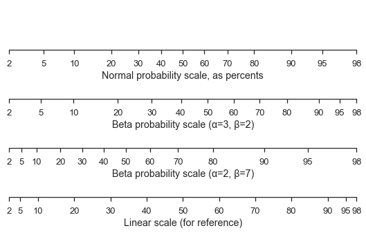
这是一个标准正态刻度,并附带两个不同的 Beta 刻度和一个线性刻度以供比较。
fig, (ax1, ax2, ax3, ax4) = pyplot.subplots(figsize=(9, 5), nrows=4)

for ax in [ax1, ax2, ax3, ax4]:
    ax.set_xlim(left=2, right=98)
    ax.set_yticks([])

ax1.set_xscale('prob')
ax1.set_xlabel('Normal probability scale, as percents')

beta1 = stats.beta(a=3, b=2)
ax2.set_xscale('prob', dist=beta1)
ax2.set_xlabel('Beta probability scale (α=3, β=2)')

beta2 = stats.beta(a=2, b=7)
ax3.set_xscale('prob', dist=beta2)
ax3.set_xlabel('Beta probability scale (α=2, β=7)')

ax4.set_xticks(ax1.get_xticks()[12:-12])
ax4.set_xlabel('Linear scale (for reference)')

seaborn.despine(fig=fig, left=True)
现成概率图
mpl-probscale 附带了一个小型 viz 模块,可以帮助您绘制样本的概率图。
仅使用样本数据,probscale.probplot 将创建一个图形,计算绘图位置和非超概率,并绘制所有内容。
numpy.random.seed(0)
sample = numpy.random.normal(loc=4, scale=2, size=37)
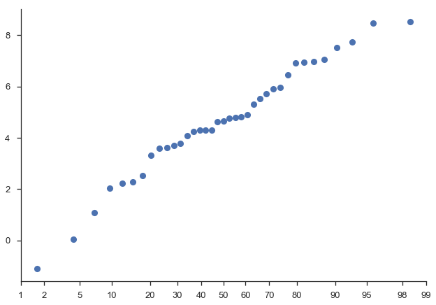
fig = probscale.probplot(sample)
seaborn.despine(fig=fig)
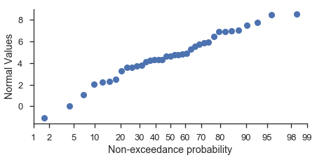
如果您希望直接使用 Matplotlib 命令来自定义绘图,则应指定绘图所在的 Matplotlib 坐标轴。
fig, ax = pyplot.subplots(figsize=(7, 3))

probscale.probplot(sample, ax=ax)

ax.set_ylabel('Normal Values')
ax.set_xlabel('Non-exceedance probability')
ax.set_xlim(left=1, right=99)
seaborn.despine(fig=fig)
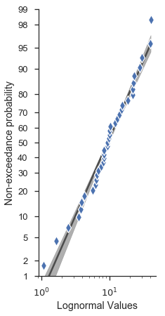
许多其他选项可以直接从 probplot 函数签名中访问。
fig, ax = pyplot.subplots(figsize=(3, 7))

numpy.random.seed(0)
new_sample = numpy.random.lognormal(mean=2.0, sigma=0.75, size=37)

probscale.probplot(
    new_sample,
    ax=ax,
    probax='y', # flip the plot
    datascale='log', # scale of the non-probability axis
    bestfit=True, # draw a best-fit line
    estimate_ci=True,
    datalabel='Lognormal Values',  # labels and markers...
    problabel='Non-exceedance probability',
    scatter_kws=dict(marker='d', zorder=2, mew=1.25, mec='w', markersize=10),
    line_kws=dict(color='0.17', linewidth=2.5, zorder=0, alpha=0.75),
)

ax.set_ylim(bottom=1, top=99)
seaborn.despine(fig=fig)
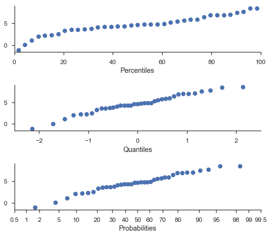
百分位数和分位数图
为方便起见,您可以使用同一函数执行百分位数和分位数绘图。
注意
百分位数和概率轴是针对相同值绘制的。唯一的区别是“百分位数”是绘制在线性刻度上的。
fig, (ax1, ax2, ax3) = pyplot.subplots(nrows=3, figsize=(8, 7))

probscale.probplot(sample, ax=ax1, plottype='pp', problabel='Percentiles')
probscale.probplot(sample, ax=ax2, plottype='qq', problabel='Quantiles')
probscale.probplot(sample, ax=ax3, plottype='prob', problabel='Probabilities')

ax2.set_xlim(left=-2.5, right=2.5)
ax3.set_xlim(left=0.5, right=99.5)
fig.tight_layout()
seaborn.despine(fig=fig)
与 seaborn FacetGrids 配合使用
好消息,各位。probplot 函数通常可以按预期与 FacetGrids 配合使用。
plot = (
    seaborn.load_dataset("tips")
        .assign(pct=lambda df: 100 * df['tip'] / df['total_bill'])
        .pipe(seaborn.FacetGrid, hue='sex', col='time', row='smoker', margin_titles=True, aspect=1., size=4)
        .map(probscale.probplot, 'pct', bestfit=True, scatter_kws=dict(alpha=0.75), probax='y')
        .add_legend()
        .set_ylabels('Non-Exceedance Probabilty')
        .set_xlabels('Tips as percent of total bill')
        .set(ylim=(0.5, 99.5), xlim=(0, 100))
)
