深入了解概率图
概述
probscale.probplot 函数可以帮助您完成几项任务。它们是:
- 创建百分位数图、分位数图或概率图。
- 将您的概率刻度放置在任一轴上。
- 为您的概率刻度指定任意分布。
- 在线性概率空间或对数概率空间中绘制最佳拟合线。
- 以您想要的任何方式计算数据的绘图位置。
- 在 seaborn
FacetGrids上使用概率轴。
我们将在本教程中介绍所有这些选项。
%matplotlib inline
import warnings
warnings.simplefilter('ignore')

import numpy
from matplotlib import pyplot
import seaborn

import probscale
clear_bkgd = {'axes.facecolor':'none', 'figure.facecolor':'none'}
seaborn.set(style='ticks', context='talk', color_codes=True, rc=clear_bkgd)

# load up some example data from the seaborn package
tips = seaborn.load_dataset("tips")
iris = seaborn.load_dataset("iris")
不同图表类型
通常有三种图表类型:
- 百分位数图,又称 P-P 图
- 分位数图,又称 Q-Q 图
- 概率图,又称 Prob 图
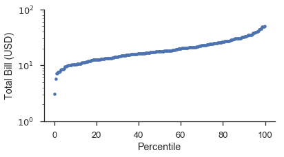
百分位数图
百分位数图是最简单的图。您只需将数据与它们的绘图位置进行绘制。绘图位置显示在线性刻度上,但数据可以按需要进行缩放。
如果您从头开始制作,它将看起来像这样:
position, bill = probscale.plot_pos(tips['total_bill'])
position *= 100
fig, ax = pyplot.subplots(figsize=(6, 3))
ax.plot(position, bill, marker='.', linestyle='none', label='Bill amount')
ax.set_xlabel('Percentile')
ax.set_ylabel('Total Bill (USD)')
ax.set_yscale('log')
ax.set_ylim(bottom=1, top=100)
seaborn.despine()
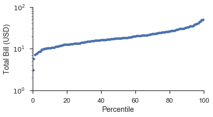
使用 probplot 函数,并设置 plottype='pp',它就变成了:
fig, ax = pyplot.subplots(figsize=(6, 3))
fig = probscale.probplot(tips['total_bill'], ax=ax, plottype='pp', datascale='log',
                         problabel='Percentile', datalabel='Total Bill (USD)',
                         scatter_kws=dict(marker='.', linestyle='none', label='Bill Amount'))
ax.set_ylim(bottom=1, top=100)
seaborn.despine()
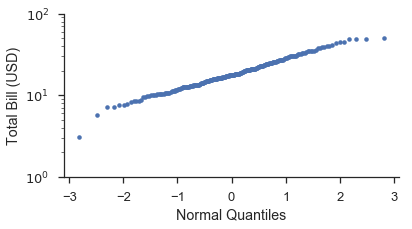
分位数图
分位数图与概率图相似。主要区别在于绘图位置是根据概率分布转换为分位数或 \(Z\)-分数。默认分布是标准正态分布。使用不同分布将在下文介绍。
使用与上文相同的数据集,让我们创建一个分位数图。像上文一样,我们将从头开始制作,然后使用 probplot。
from scipy import stats

position, bill = probscale.plot_pos(tips['total_bill'])
quantile = stats.norm.ppf(position)

fig, ax = pyplot.subplots(figsize=(6, 3))
ax.plot(quantile, bill, marker='.', linestyle='none', label='Bill amount')
ax.set_xlabel('Normal Quantiles')
ax.set_ylabel('Total Bill (USD)')
ax.set_yscale('log')
ax.set_ylim(bottom=1, top=100)
seaborn.despine()
使用 probplot
fig, ax = pyplot.subplots(figsize=(6, 3))
fig = probscale.probplot(tips['total_bill'], ax=ax, plottype='qq', datascale='log',
                         problabel='Standard Normal Quantiles', datalabel='Total Bill (USD)',
                         scatter_kws=dict(marker='.', linestyle='none', label='Bill Amount'))

ax.set_ylim(bottom=1, top=100)
seaborn.despine()
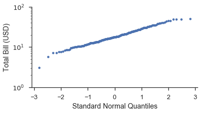
您会注意到 Q-Q 图上的数据形状比 P-P 图更直。这是由于将绘图位置转换为分布分位数时发生的变换。下面的图希望能更清楚地说明这一点。此外,我们将展示如何使用 probax 选项来翻转图,使 P-P/Q-Q/概率轴位于 y 轴上。
fig, (ax1, ax2) = pyplot.subplots(figsize=(6, 6), ncols=2, sharex=True)
markers = dict(marker='.', linestyle='none', label='Bill Amount')

fig = probscale.probplot(tips['total_bill'], ax=ax1, plottype='pp', probax='y',
                         datascale='log', problabel='Percentiles',
                         datalabel='Total Bill (USD)', scatter_kws=markers)

fig = probscale.probplot(tips['total_bill'], ax=ax2, plottype='qq', probax='y',
                         datascale='log', problabel='Standard Normal Quantiles',
                         datalabel='Total Bill (USD)', scatter_kws=markers)

ax1.set_xlim(left=1, right=100)
fig.tight_layout()
seaborn.despine()
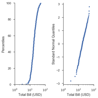
在 P-P 图和简单 Q-Q 图的情况下,与编写原始 matplotlib 命令相比,probplot 函数并未提供太多便利。然而,当您开始制作概率图并使用更高级的选项时,情况就不同了。
概率图
从视觉上看,概率刻度和分位数刻度上的图表曲线应相同。不同之处在于轴刻度是根据非超概率(non-exceedance probabilities)而不是更抽象的分布分位数来放置和标记的。
不出所料,图片能更好地解释这一点。让我们以上一个图为基础:
fig, (ax1, ax2, ax3) = pyplot.subplots(figsize=(9, 6), ncols=3, sharex=True)
common_opts = dict(
    probax='y',
    datascale='log',
    datalabel='Total Bill (USD)',
    scatter_kws=dict(marker='.', linestyle='none')
)

fig = probscale.probplot(tips['total_bill'], ax=ax1, plottype='pp',
                         problabel='Percentiles',  **common_opts)

fig = probscale.probplot(tips['total_bill'], ax=ax2, plottype='qq',
                         problabel='Standard Normal Quantiles',  **common_opts)

fig = probscale.probplot(tips['total_bill'], ax=ax3, plottype='prob',
                         problabel='Standard Normal Probabilities',  **common_opts)

ax3.set_xlim(left=1, right=100)
ax3.set_ylim(bottom=0.13, top=99.87)
fig.tight_layout()
seaborn.despine()
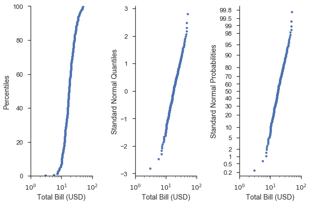
从视觉上看,最右边图表中的曲线形状是相同的。不同之处在于 y 轴的刻度和标签更“人性化”。
换句话说,概率轴(右)使我们能够轻松找到例如在百分位数轴(左)上找到的第 75 百分位数,并说明了数据与给定分布(如分位数轴(中))的拟合程度。
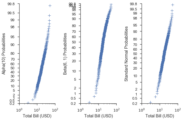
为您的刻度使用不同的分布
当使用分位数或概率刻度时,您可以将 scipy.stats 模块中的分布传递给 probplot 函数。如果未向 dist 参数提供分布,则使用标准正态分布。
common_opts = dict(
    plottype='prob',
    probax='y',
    datascale='log',
    datalabel='Total Bill (USD)',
    scatter_kws=dict(marker='+', linestyle='none', mew=1)
)

alpha = stats.alpha(10)
beta = stats.beta(6, 3)

fig, (ax1, ax2, ax3) = pyplot.subplots(figsize=(9, 6), ncols=3, sharex=True)
fig = probscale.probplot(tips['total_bill'], ax=ax1, dist=alpha,
                         problabel='Alpha(10) Probabilities', **common_opts)

fig = probscale.probplot(tips['total_bill'], ax=ax2, dist=beta,
                         problabel='Beta(6, 1) Probabilities', **common_opts)

fig = probscale.probplot(tips['total_bill'], ax=ax3, dist=None,
                         problabel='Standard Normal Probabilities', **common_opts)

ax3.set_xlim(left=1, right=100)
for ax in [ax1, ax2, ax3]:
    ax.set_ylim(bottom=0.2, top=99.8)
seaborn.despine()
fig.tight_layout()
这也适用于 QQ 刻度:
common_opts = dict(
    plottype='qq',
    probax='y',
    datascale='log',
    datalabel='Total Bill (USD)',
    scatter_kws=dict(marker='+', linestyle='none', mew=1)
)

alpha = stats.alpha(10)
beta = stats.beta(6, 3)

fig, (ax1, ax2, ax3) = pyplot.subplots(figsize=(9, 6), ncols=3, sharex=True)
fig = probscale.probplot(tips['total_bill'], ax=ax1, dist=alpha,
                         problabel='Alpha(10) Quantiles', **common_opts)

fig = probscale.probplot(tips['total_bill'], ax=ax2, dist=beta,
                         problabel='Beta(6, 3) Quantiles', **common_opts)

fig = probscale.probplot(tips['total_bill'], ax=ax3, dist=None,
                         problabel='Standard Normal Quantiles', **common_opts)

ax1.set_xlim(left=1, right=100)
seaborn.despine()
fig.tight_layout()

使用特定分布和分位数刻度可以让我们了解数据与该分布的拟合程度。例如,假设我们猜测数据集中 total_bill 列的值呈正态分布,其均值和标准差分别为 19.8 和 8.9。我们可以通过创建一个具有这些参数的 scipy.stat.norm 分布并在 Q-Q 图中使用该分布来对此进行调查。
def equality_line(ax, label=None):
    limits = [
        numpy.min([ax.get_xlim(), ax.get_ylim()]),
        numpy.max([ax.get_xlim(), ax.get_ylim()]),
    ]
    ax.set_xlim(limits)
    ax.set_ylim(limits)
    ax.plot(limits, limits, 'k-', alpha=0.75, zorder=0, label=label)

norm = stats.norm(loc=21, scale=8)
fig, ax = pyplot.subplots(figsize=(5, 5))
ax.set_aspect('equal')

common_opts = dict(
    plottype='qq',
    probax='x',
    problabel='Theoretical Quantiles',
    datalabel='Emperical Quantiles',
    scatter_kws=dict(label='Bill amounts')
)

fig = probscale.probplot(tips['total_bill'], ax=ax, dist=norm, **common_opts)

equality_line(ax, label='Guessed Normal Distribution')
ax.legend(loc='lower right')
seaborn.despine()
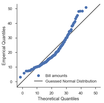
嗯。看起来不太好。让我们使用 scipy 的拟合功能来尝试对数正态分布。
lognorm_params = stats.lognorm.fit(tips['total_bill'], floc=0)
lognorm = stats.lognorm(*lognorm_params)
fig, ax = pyplot.subplots(figsize=(5, 5))
ax.set_aspect('equal')

fig = probscale.probplot(tips['total_bill'], ax=ax, dist=lognorm, **common_opts)

equality_line(ax, label='Fit Lognormal Distribution')
ax.legend(loc='lower right')
seaborn.despine()
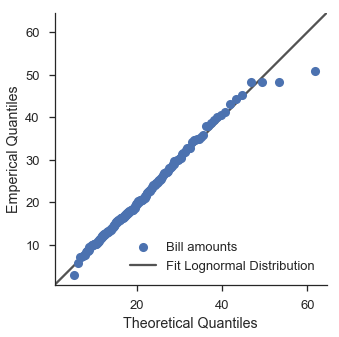
好一点了。
寻找最佳分布留给读者作为练习。
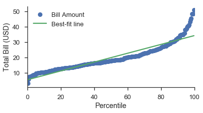
最佳拟合线
向概率图添加最佳拟合线可以深入了解数据集是否可以用某种分布来表征。
这可以通过 probplot 中的 bestfit=True 选项轻松完成。在幕后,probplot 会根据绘图类型和数据轴的刻度(通过 datascale 控制)转换用于回归的 x 和 y 数据。
线的视觉属性可以通过 line_kws 参数进行控制。如果您想标记最佳拟合线,可以在此处指定其标签。
简单示例
最简单的情况是带有线性数据轴的 P-P 图:
fig, ax = pyplot.subplots(figsize=(6, 3))
fig = probscale.probplot(tips['total_bill'], ax=ax, plottype='pp', bestfit=True,
                         problabel='Percentile', datalabel='Total Bill (USD)',
                         scatter_kws=dict(label='Bill Amount'),
                         line_kws=dict(label='Best-fit line'))
ax.legend(loc='upper left')
seaborn.despine()
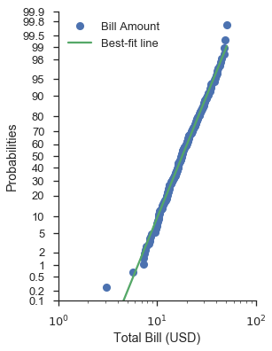
最不简单的情况是带有对数刻度数据轴的概率图。
正如关于带有自定义分布的分位数图部分所暗示的,使用正态概率刻度和对数正态数据刻度可以提供不错的拟合(视觉上而言)。
请注意,您仍然可以将概率刻度放在 x 轴或 y 轴上。
fig, ax = pyplot.subplots(figsize=(4, 6))
fig = probscale.probplot(tips['total_bill'], ax=ax, plottype='prob', probax='y', bestfit=True,
                         datascale='log', problabel='Probabilities', datalabel='Total Bill (USD)',
                         scatter_kws=dict(label='Bill Amount'),
                         line_kws=dict(label='Best-fit line'))
ax.legend(loc='upper left')
ax.set_ylim(bottom=0.1, top=99.9)
ax.set_xlim(left=1, right=100)
seaborn.despine()
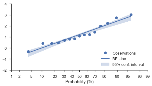
自助法置信区间
无论图表的刻度如何(线性、对数或概率),您都可以在最佳拟合线周围添加自助法置信区间。只需将 estimate_ci=True 选项与 bestfit=True 一起使用即可。
N = 15
numpy.random.seed(0)
x = numpy.random.normal(size=N) + numpy.random.uniform(size=N)
fig, ax = pyplot.subplots(figsize=(8, 4))
fig = probscale.probplot(x, ax=ax, bestfit=True, estimate_ci=True,
                         line_kws={'label': 'BF Line', 'color': 'b'},
                         scatter_kws={'label': 'Observations'},
                         problabel='Probability (%)')
ax.legend(loc='lower right')
ax.set_ylim(bottom=-2, top=4)
seaborn.despine(fig)
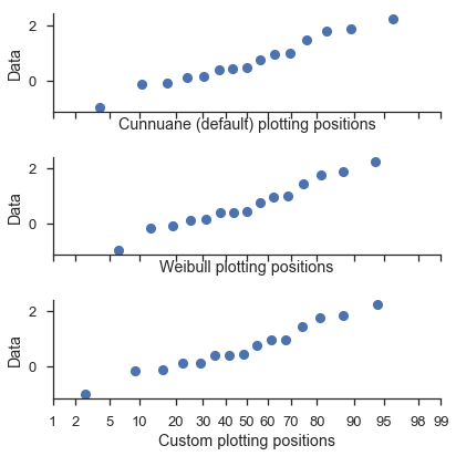
调整绘图位置
probplot 函数调用 viz.plot_plos() 函数来计算每个数据集的绘图位置。
您应该阅读该函数的文档字符串以获取更详细的信息。但高层次的概述是,您可以在绘图位置计算中调整几个参数(alpha 和 beta)。
最常用的值可以通过 postype 参数选择。
这些通过 probplot 中的 pp_kws 参数进行控制,并将在下一教程中进行更详细的讨论。
common_opts = dict(
    plottype='prob',
    probax='x',
    datalabel='Data',
)

numpy.random.seed(0)
x = numpy.random.normal(size=15)

fig, (ax1, ax2, ax3) = pyplot.subplots(figsize=(6, 6), nrows=3,
                                       sharey=True, sharex=True)
fig = probscale.probplot(x, ax=ax1, problabel='Cunnuane (default) plotting positions',
                         **common_opts)

fig = probscale.probplot(x, ax=ax2, problabel='Weibull plotting positions',
                         pp_kws=dict(postype='weibull'), **common_opts)

fig = probscale.probplot(x, ax=ax3, problabel='Custom plotting positions',
                         pp_kws=dict(alpha=0.6, beta=0.1), **common_opts)
ax1.set_xlim(left=1, right=99)
seaborn.despine()
fig.tight_layout()
控制绘图元素的视觉效果
正如上例中暗示的,probplot 函数接受两个字典来定制数据系列和最佳拟合线(分别为 scatter_kws 和 line_kws)。这些字典直接传递给当前轴的 plot 方法。
默认情况下,数据系列假定 linestyle='none' 和 marker='o'。这些可以通过 scatter_kws 覆盖。
回顾上一个例子,我们可以这样自定义它:
scatter_options = dict(
    marker='^',
    markerfacecolor='none',
    markeredgecolor='firebrick',
    markeredgewidth=1.25,
    linestyle='none',
    alpha=0.35,
    zorder=5,
    label='Meal Cost ($)'
)

line_options = dict(
    dashes=(10,2,5,2,10,2),
    color='0.25',
    linewidth=3,
    zorder=10,
    label='Best-fit line'
)

fig, ax = pyplot.subplots(figsize=(4, 6))
fig = probscale.probplot(tips['total_bill'], ax=ax, plottype='prob', probax='y', bestfit=True,
                         datascale='log', problabel='Probabilities', datalabel='Total Bill (USD)',
                         scatter_kws=scatter_options, line_kws=line_options)
ax.legend(loc='upper left')
ax.set_ylim(bottom=0.1, top=99.9)
seaborn.despine()

注意
probplot 函数可以接受两个额外的美学参数:color 和 label。如果提供,color 将分别覆盖 scatter_kws 和 line_kws 参数的标记面颜色和线颜色选项。类似地,散点系列的标签将被显式参数覆盖。不建议使用 color 和 label。它们主要为了与 seaborn 包兼容而存在。
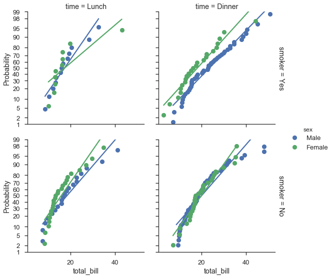
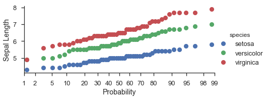
将概率图映射到 seaborn FacetGrids
通常,probplot 是在考虑 FacetGrids 的情况下编写的。您只需在调用 FacetGrid.map 时指定数据列和其他选项即可。
不幸的是,标签没有完全按照我的意愿显示,但这仍在开发中。
fg = (
    seaborn.FacetGrid(data=iris, hue='species', aspect=2)
        .map(probscale.probplot, 'sepal_length')
        .set_axis_labels(x_var='Probability', y_var='Sepal Length')
        .add_legend()
)
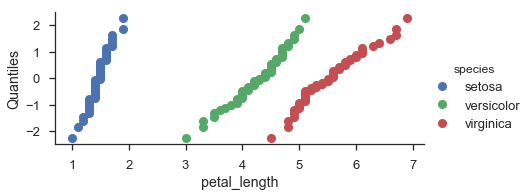
fg = (
    seaborn.FacetGrid(data=iris, hue='species', aspect=2)
        .map(probscale.probplot, 'petal_length', plottype='qq', probax='y')
        .set_ylabels('Quantiles')
        .add_legend()
)
fg = (
    seaborn.FacetGrid(data=tips, hue='sex', row='smoker', col='time', margin_titles=True, size=4)
        .map(probscale.probplot, 'total_bill', probax='y', bestfit=True)
        .set_ylabels('Probability')
        .add_legend()
)